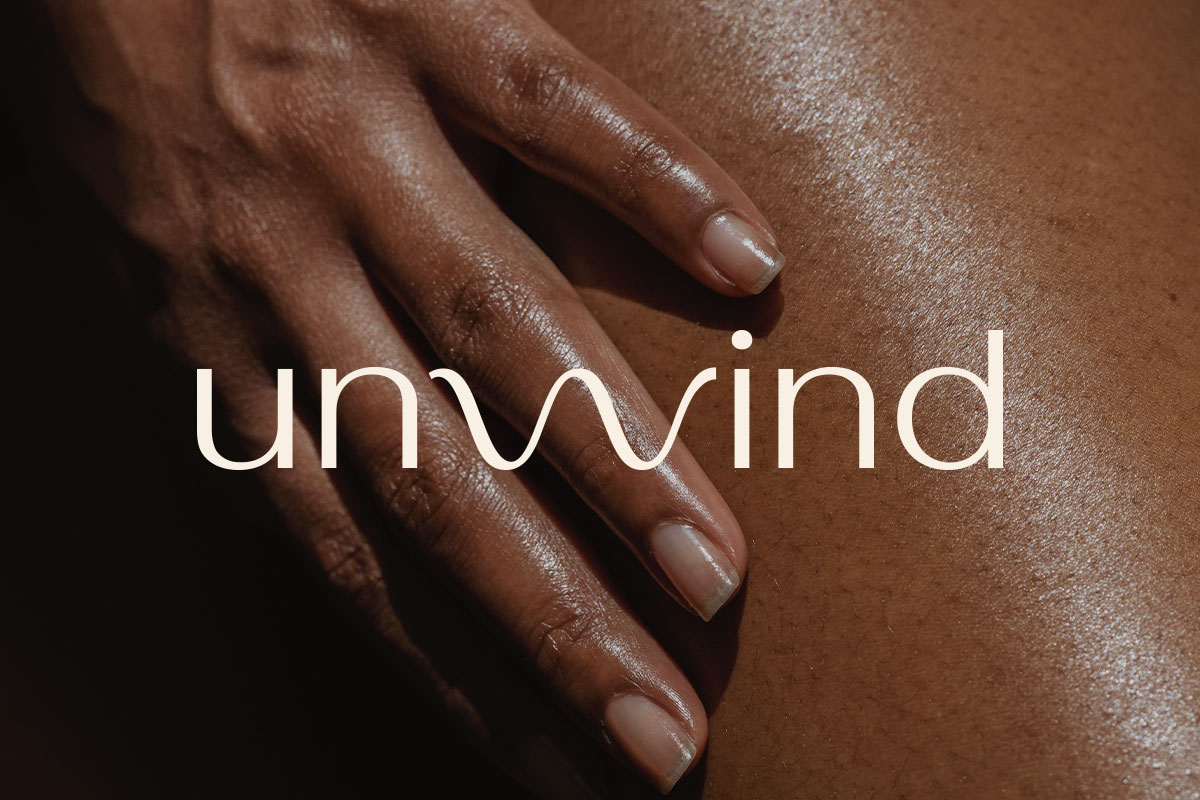
Unwind Brand
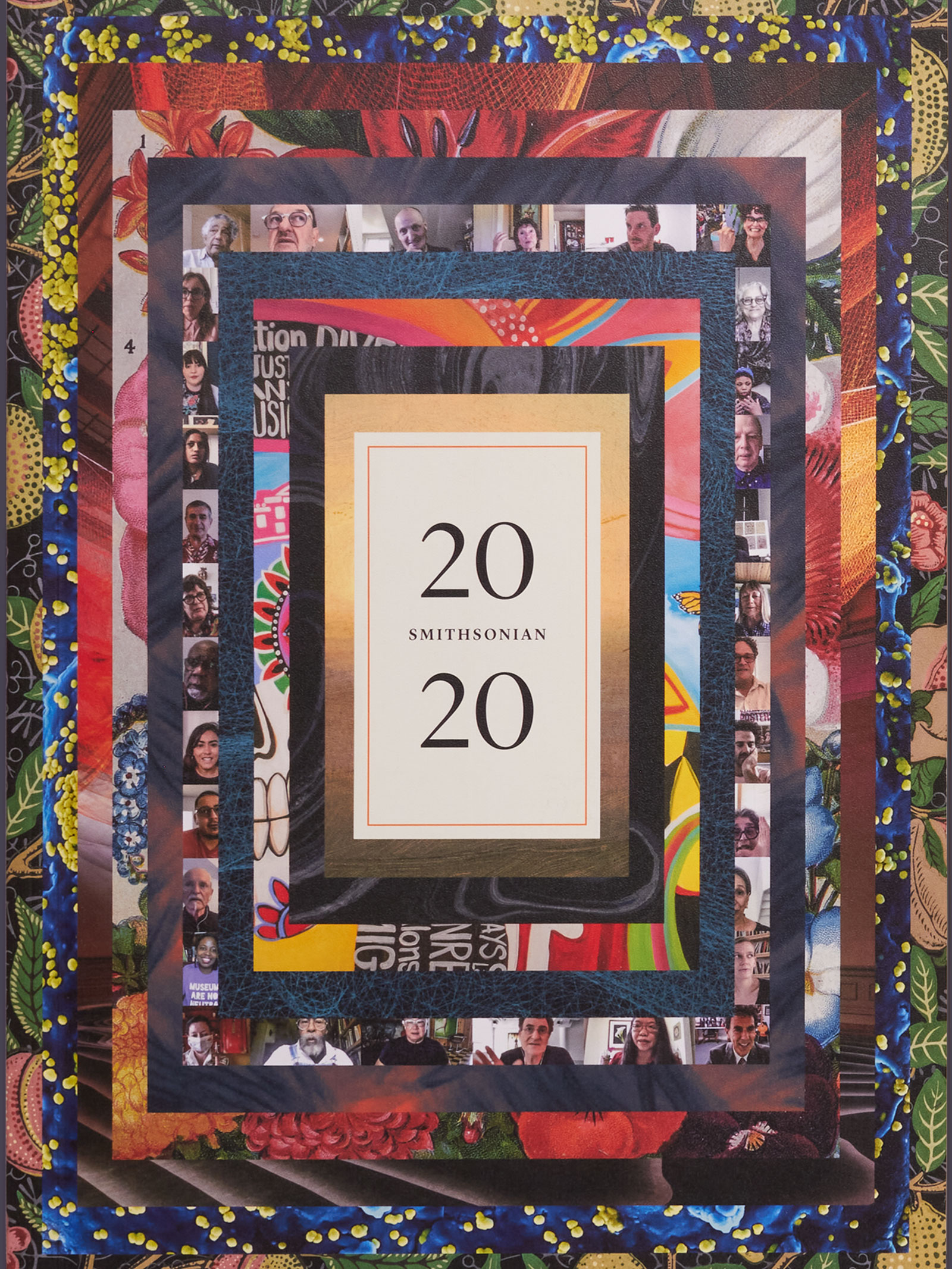
Smithsonian Institution 2020 Annual Report
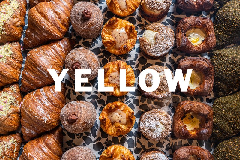
YELLOW Brand
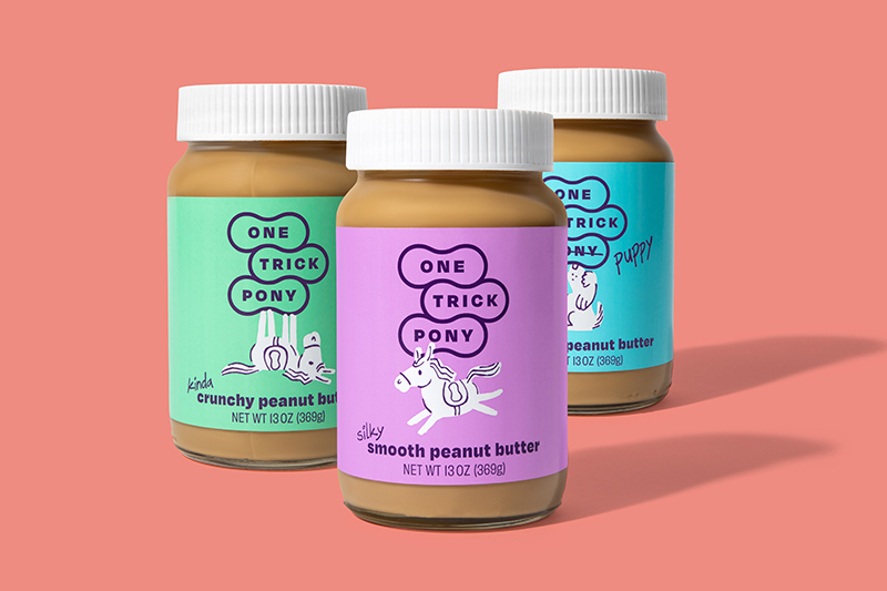
One Trick Pony Brand
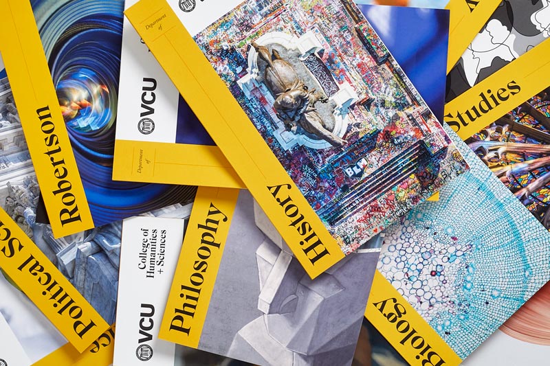
Virginia Commonwealth University Print Collateral
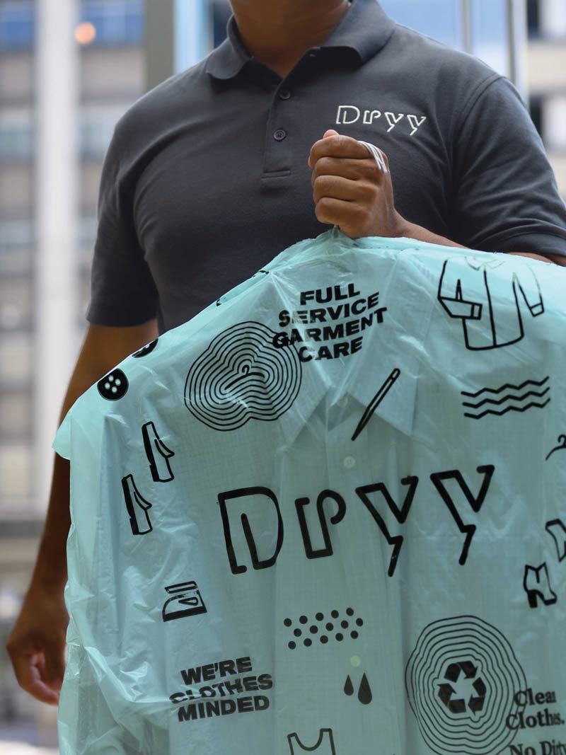
Dryy Brand
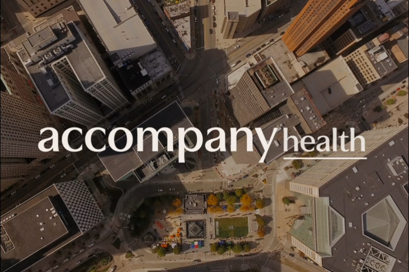
Accompany Health Brand
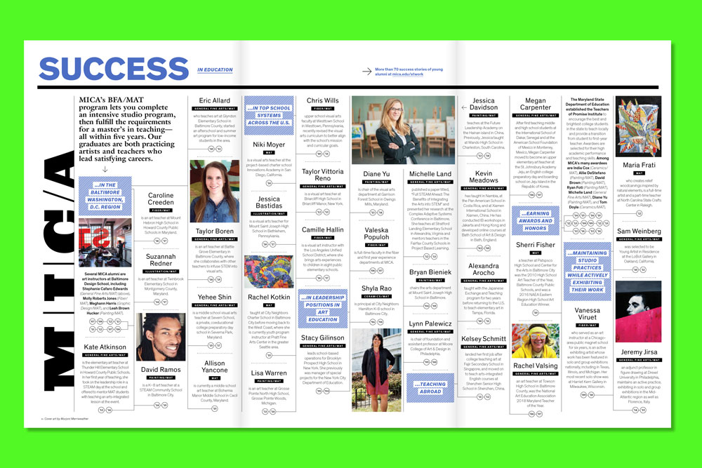
Maryland Institute College of Art Print Collateral
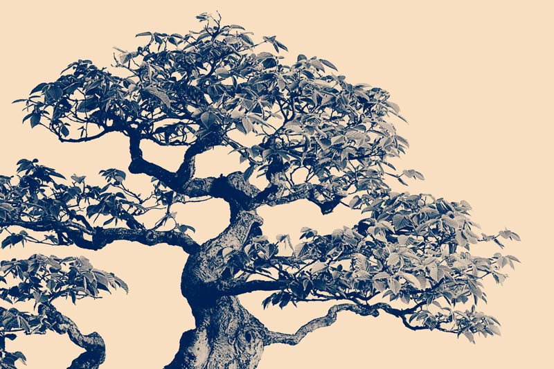
National Bonsai Foundation Annual Report
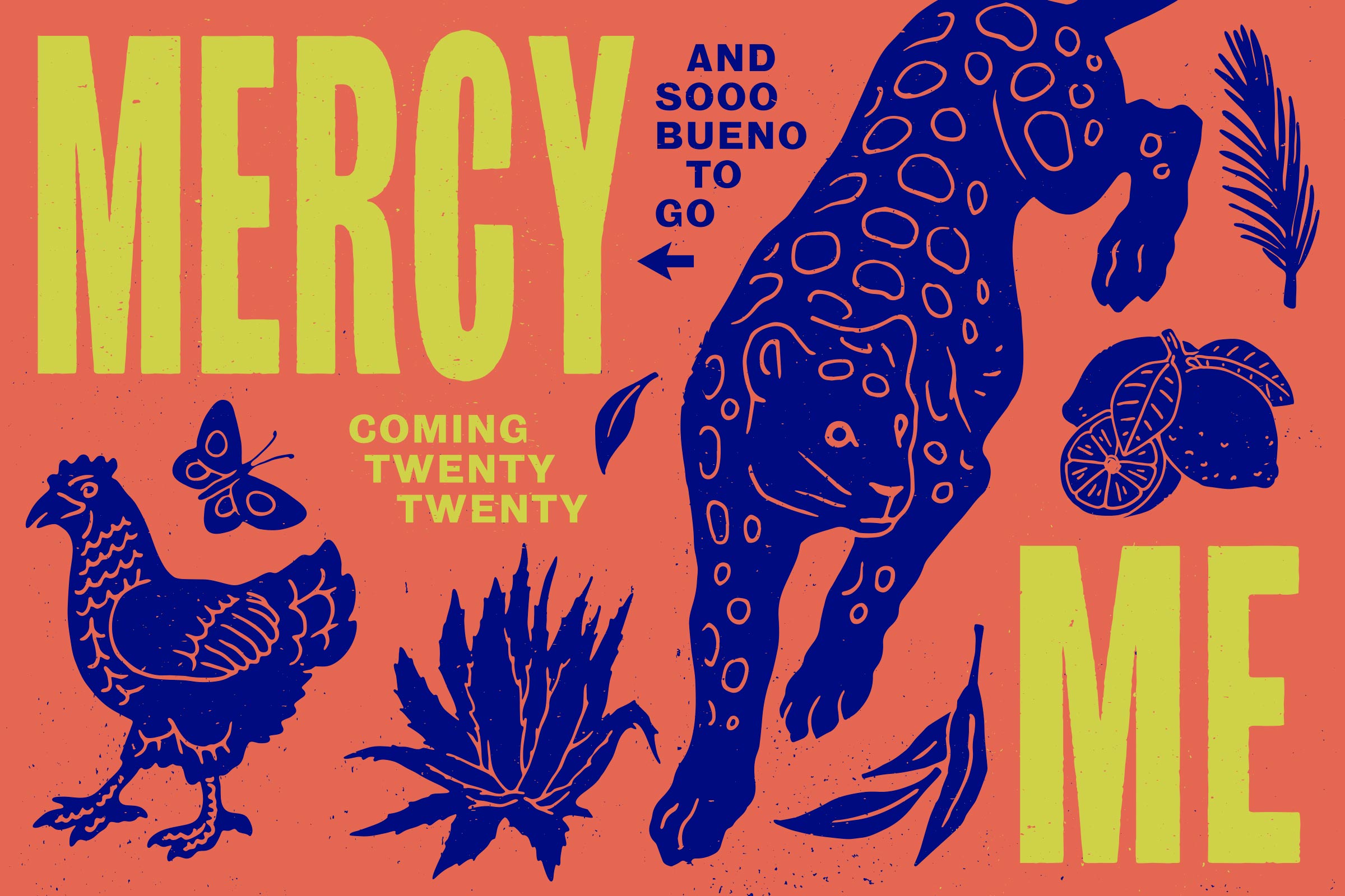
Mercy Me Brand
Poppyseed Rye Brand
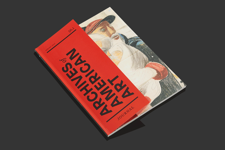
Archives of American Art Journal Publication
view more projects...
© 2024 Polygraph®. All rights reserved.
projects@polygraphcreative.com+1 202 670 7659
instagram linkedin pinterest